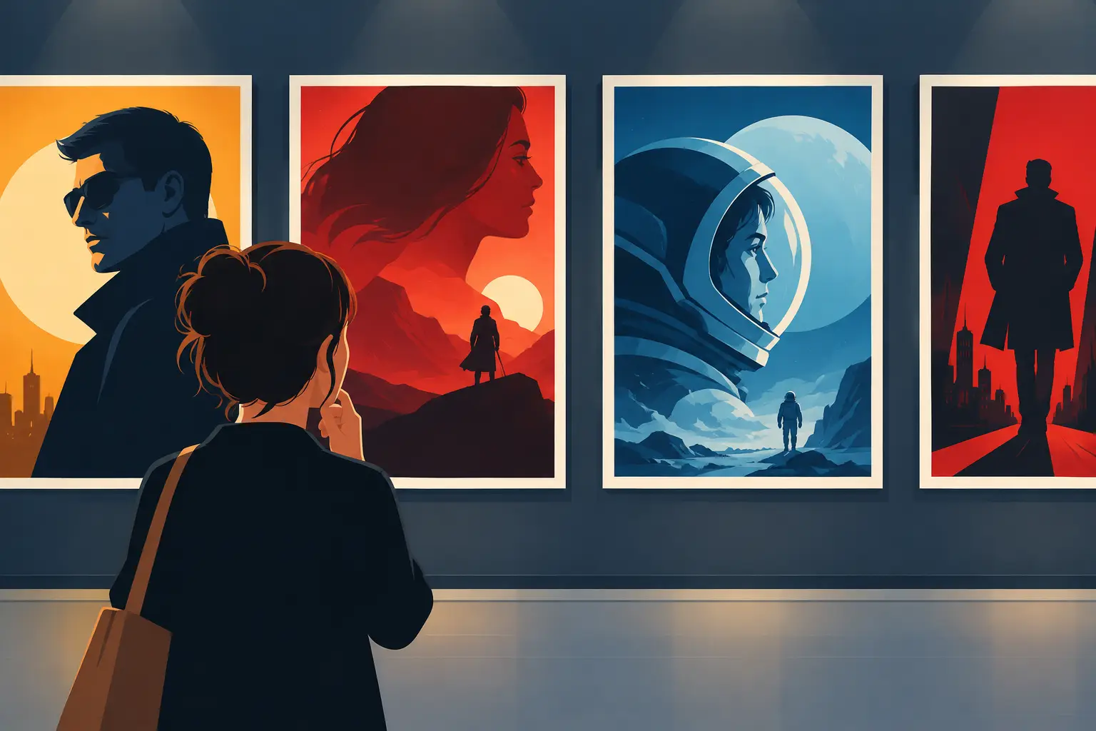
A great poster can make you pause before you know why. Maybe it is a shark cutting through black water. Maybe it is a yellow suit, a red balloon, or one face lit like trouble is about to begin. Before a trailer plays or a review appears in your feed, movie posters have already started telling you what kind of night you are in for.
That is a big job for one image. A poster has to sell a story, signal a genre, spotlight talent, and leave just enough unsaid to pull you closer. The best ones feel less like ads and more like tiny pieces of movie magic.
Movie Posters Are Fast Film Language
You can read a poster in seconds because movies have taught us a visual vocabulary. Dark blue lighting, a lone figure, and a distant city usually mean danger or mystery. Warm sunlight, two people almost touching, and handwritten type point toward romance. A character running toward the camera with something exploding behind them is not exactly subtle, but subtle is not always the assignment.
Color does much of the early work. Red can suggest passion, violence, or both. Black creates contrast and threat. Pastel palettes can promise charm, nostalgia, or a carefully styled comedy. None of these choices lock a movie into one meaning, but they help viewers make a fast guess. That guess matters when someone is scrolling through a streaming menu at 11:40 p.m. and has the attention span of a trailer cut.
Composition adds another layer. A huge face means a star, a character study, or a personality strong enough to carry the whole thing. A tiny person swallowed by a massive landscape says the odds are bad. An ensemble arranged in a neat lineup tells you to expect a group dynamic, whether that group is a family, a crew, or several people who should absolutely not be trusted with the same mission.
The poster is not trying to explain everything. It is trying to create an immediate feeling: this one is funny, this one is strange, this one might ruin you emotionally, this one has a monster with excellent branding.
The Best Posters Leave Space for Curiosity
There is a difference between a poster that tells you the premise and one that hands you a question. The second kind tends to stick.
Think about iconic designs built around a single strong visual: the cracked egg in Alien, the ominous smile in The Dark Knight, the reaching hands in E.T.. You do not need a plot synopsis to feel the tone. The image does the work, then lets your imagination fill the empty space.
That restraint is harder than it looks. Marketing teams want recognizable actors, studios want franchise signals, and audiences often want to know what they are getting. So posters are always balancing mystery against clarity. An abstract design can become a cult favorite, but it can also leave casual viewers wondering whether the film is horror, sci-fi, or a very expensive cologne commercial.
A more literal poster can be effective, especially for broad comedies and action movies. If the goal is instant recognition, putting the stars front and center makes sense. The trade-off is that many posters start to look interchangeable: faces floating in layers, a dramatic horizon, a title at the bottom, and enough blue-and-orange lighting to power a small city.
Why So Many Modern Posters Look Familiar
It is easy to blame lazy design, but the real answer is more complicated. Movie marketing has to work across theaters, streaming platforms, social feeds, phone screens, international campaigns, and cast announcements. A delicate visual idea that sings on a giant theater wall may disappear as a thumbnail.
That is why modern movie posters often favor big faces, bold contrast, and clear genre signals. These choices are practical. They help people recognize a title quickly, especially when a movie is competing with hundreds of other options. A poster is no longer just something you pass on the way into a theater. It is also a tiny square between a true-crime series and three things you added to your watchlist last year.
Still, practical does not have to mean forgettable. The strongest contemporary campaigns find a visual hook that survives at every size. A distinctive color, silhouette, prop, or piece of typography can do more than a crowded collage ever could. You should be able to spot the movie from across the room or while half-paying attention on your phone.
That is part of the fun for film fans. Once you notice the patterns, you cannot unsee them. You start predicting the genre from the font. You clock the prestige-drama profile shot. You recognize when a horror poster has made an innocent household object look deeply suspicious.
A Poster Can Change How We Remember a Movie
Some films outgrow their original release through poster art. A great image can become the memory people carry, even if they have not watched the movie in years. It ends up on dorm walls, framed in living rooms, printed on shirts, and passed around whenever someone asks for a recommendation.
That can create a slightly weird split between the poster and the film itself. A poster may promise a wild sci-fi adventure when the movie is actually quiet and philosophical. It may sell a romance as a glossy comedy because glossy comedy is easier to market. Sometimes that mismatch disappoints people. Other times, it becomes part of the movie's history.
Different versions can tell different stories, too. The original theatrical art might lean on star power, while a later re-release poster leans into cult status. International designs may emphasize a different character or shift the tone entirely. Collectors care about these details because a poster is not just decoration. It is evidence of how a movie was presented to the world at a specific moment.
How to Read the Clues in Movie Posters
The next time a poster catches your eye, look past the title. Start with what is missing. Is there no face? No setting? No visible threat? That absence is often intentional. It tells you the campaign wants mood before information.
Then look at scale. Who gets to be biggest? Who is placed in shadow? Is the title massive, or does it almost disappear into the image? These choices reveal what the studio thinks will bring people in. A giant title may be selling a famous franchise. A giant actor may be selling a performance. A giant haunted house is, thankfully, selling a haunted house.
Typography deserves attention too. Sharp, metallic letters feel very different from soft script or a rough, handwritten title. Fonts can date a poster instantly, but that is part of their charm. A poster from the 1980s often looks like it knows exactly how much synth is on the soundtrack. A poster from the 1990s may have one raised eyebrow and a suspicious amount of white space.
Try making a prediction before you read the synopsis. Guess the genre, the central conflict, and the kind of ending it might have. Then watch the movie and see what the poster got right, what it hid, and what it flat-out invented. It is a quick game that turns browsing into a small test of film instincts.
The Poster as a Daily Movie Puzzle
Movie posters work especially well as trivia because they sit at the intersection of memory and deduction. You may not remember every character name, but you remember the red coat. You remember the empty road, the impossible skyline, the strange object held in the center of the frame. One visual clue can bring an entire movie rushing back.
That is also why poster-based prompts reward different kinds of film knowledge. A blockbuster fan may spot a franchise from its logo. A horror fan may recognize a specific visual style. A person who watches everything may know a movie from the billing order, the color palette, or an image that barely appears in the finished film.
For a quick daily challenge, that makes posters nearly perfect. They give you a clue without giving away the answer, and they turn movie memory into something you can play with. PlotLuck lives in that sweet spot: a small film question, a sharp recognition moment, and the satisfaction of knowing you got there before the reveal.
The next poster you pass should get more than a glance. Give it ten seconds. Ask what it is promising, what it is hiding, and whether you would recognize the movie with the title covered up. Sometimes the image gives you the answer right away. Sometimes it gives you a better question.